
Welcome!
By Felipe Lamounier, state of Minas Gerais, Brazil – powered by 🙂My Easy B.I.
In this post we will see a series of straight to the point videos that will approach the subject of Dynamically Customizing Power BI visuals, changing axes in charts using field parameters dynamically.
🔭 See also Related Posts:
📑 Table of Contents:
- 🔀Dynamic Visual Experience
- 🔃Dynamic X and Y Axis in Power BI visuals with Field Parameters
- 👀A different perspective with Power BI Personalized Visuals
- 🗃️Bonus: Microsoft Documentation
Anúncios
🔀Dynamic Visual Experience
Anúncios
🔃Dynamic X and Y Axis in Power BI visuals with Field Parameters
Anúncios
👀A different perspective with Power BI Personalized Visuals
Anúncios
🗃️Bonus: Microsoft Documentation
Let report readers use field parameters to change visuals
https://docs.microsoft.com/en-us/power-bi/create-reports/power-bi-field-parameters ↗️
Personalize visuals in a report
https://docs.microsoft.com/en-us/power-bi/consumer/end-user-personalize-visuals ↗️
Anúncios
Keywords: Power BI as Data Explorer, Changing Axis in Power BI automatically;
Did you like the content? Want to get more tips? Subscribe ↗ for free!
Follow on social media:
- How to Find Deleted VTTK Transport in SAP ECC
 Bem Vindo! | Welcome! By Felipe Lamounier, Minas Gerais, Brasil🇧🇷 – powered by 🙂My Easy B.I. 📑 Table of Contents: Introduction In this post, we will learn how to identify which transports were deleted in SAP ECC. We will also see how this data is removed from the VTTK table over a specific period. InContinuar lendo “How to Find Deleted VTTK Transport in SAP ECC”
 - How to identify SAP BW Process Chains with Recurring Errors
 This post by Felipe Lamounier focuses on identifying recurring errors in Process Chains (RSPC) within SAP BW over a 65-day period. It provides a structured approach to filter and analyze execution logs, aimed at improving resource management and system efficiency by addressing improperly executed chains. The analysis concludes with recommendations for maintaining or removing chains based on error frequency.
 - How to Retrieve SAP Table Metadata Efficiently
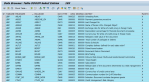 This post by Felipe Lamounier provides a guide on efficiently retrieving metadata from SAP table fields using transaction SE16 and the DD03M view. Key elements include data element, data type, field length, and descriptions. Additionally, the post lists important SAP system tables, enhancing understanding of SAP metadata extraction.
